
Hover to zoom · click to enlarge
| Composition | Protein DHA Nutritional ingredients |
|---|---|
| Packing | 200GM |
| SHELF LIFE | 18 MONTHS |
| HSN CODE | 2106 |
| Category | AYURVEDIC/HERBALS |
| Supply | Wholesale & Export |
Format: Vertical portrait, approximately 2:3 aspect ratio.
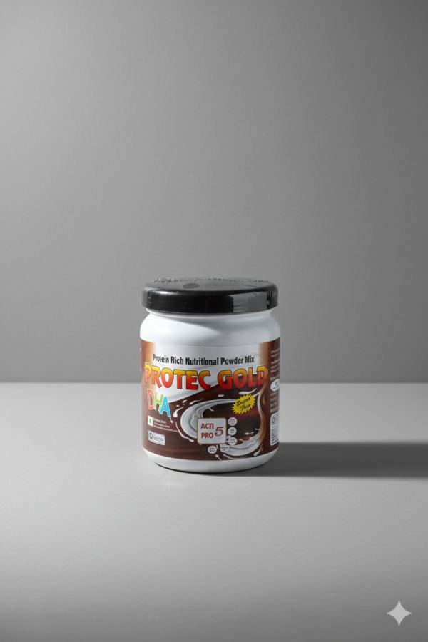
Subject: A single white plastic nutritional-powder jar positioned slightly below the vertical center.
Composition style: Minimalist studio product photography with substantial negative space.
The jar occupies roughly the central 30–35% of the image width, leaving a large amount of empty gray background around it.
The visual hierarchy is very clear: jar → label → ground shadow → neutral background.
The jar is centered almost exactly on the horizontal axis.
Vertically, it sits around the middle-to-lower portion of the frame.
The tabletop begins around the upper-middle/lower-middle transition, creating a distinct horizontal division between:
Gray vertical backdrop
Gray horizontal surface
The jar's base sits comfortably above the bottom edge, giving it breathing room.
The container faces the camera almost directly, but is rotated slightly, revealing a narrow portion of its side.
The cylindrical form is emphasized by:
Visible curvature of the front label
Rounded shoulder
Elliptical top/lid
Subtle side distortion
The black lid provides strong visual contrast against the white container and gray environment.
The front label is the most visually complex portion of the image.
Visible hierarchy:
Small upper text: “Protein Rich Nutritional Powder Mix”
Large headline branding: “PROTEC GOLD”
Large secondary lettering around “DHA”
Central/lower product graphics
A prominent “ACTI PRO 5” box
Smaller nutritional/brand badges and decorative elements
The label uses a brown/dark base with warm yellow/orange and white typography, creating contrast with the white jar.
The background is deliberately plain and non-distracting.
It is a medium-to-dark neutral gray with a subtle tonal gradient.
The upper-left area appears somewhat lighter, while the right side becomes darker.
There are no environmental objects, props, people, plants, or scenery competing with the product.
This gives the image a premium commercial/catalogue aesthetic.
The jar sits on a matte gray studio surface.
A relatively strong cast shadow extends toward the right, indicating illumination primarily from the upper-left/front-left.
There is also a soft contact shadow immediately underneath the jar, anchoring it to the surface.
The shadow is diffuse rather than sharply defined, suggesting a large/soft light source.
The lighting is characteristic of controlled product photography:
Key light: From upper-left/front-left.
Highlights: Visible along the white jar and portions of the lid.
Right side: Noticeably darker, producing dimensionality.
Backdrop: Gradually falls into shadow toward the right.
Reflection: The black lid catches a subtle highlight along its upper surface.
The lighting is relatively soft, avoiding harsh edges while retaining the cylindrical shape.
Camera is approximately at product mid-height, with a slightly elevated viewpoint.
We can see a little of the top of the lid, so the camera is not perfectly level with the jar.
Perspective distortion is restrained; the product maintains a natural cylindrical appearance.
The jar appears photographed with a moderate/longer focal length, rather than an extreme wide-angle lens.
The jar is the primary sharp element.
The background is relatively smooth and visually subdued.
Depth of field appears sufficient to keep the entire front product reasonably legible while preventing the background from becoming important.
The image has a clean commercial-product feel rather than a lifestyle-photography feel.
The image deliberately uses a restrained palette:
The brown label and black lid are therefore the main sources of saturation and contrast.
A major compositional feature is the large amount of empty space:
Large gray area above the product
Significant space left and right
Moderate space below the jar
This makes the jar feel isolated, clean, and premium, and would also leave room for advertising copy if this were being used as a commercial layout.
There is a small four-point/star-like mark in the bottom-right corner of the image. It is separate from the physical product and appears to function as an image/design artifact or decorative overlay.
Minimalist centered product shot + neutral seamless studio background + soft upper-left key light + rightward cast shadow + moderate elevated camera angle + controlled negative space + high-contrast branded label.
The strongest visual structure is essentially:
EMPTY GRAY SPACE → PRODUCT → SOFT SHADOW → EMPTY GRAY SPACE
with the PROTEC GOLD label providing the visual detail and color contrast.
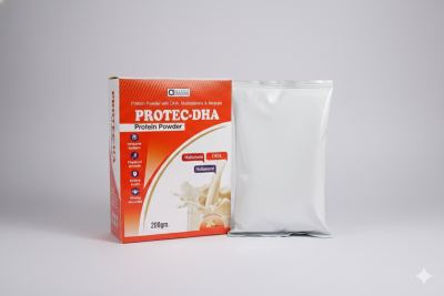
Protein DHA (Docosahexaenoic Acid) Multivitamins Minerals
200GM